Modernism and the Web
Studying the seminal works of graphic design, we are in awe of the fact that, beyond their effectiveness at visually communicating a message, they also impart a sense of poetic beauty. Maybe it is the judicious use of geometric shapes and chromatic harmonies. Or this sense of restraint in the composition. Or the deep, almost philosophical gravity of a grid system in the work's foundation. Whatever the reason may be, these works have nothing incidental about them, they are obviously the result of great mastery in one's craft.
For many software developers, mastery in one's craft is something like the holy grail, and ways that lead to it a subject of great interest and passion. Looking at the life and career of Josef Müller-Brockmann, we will note that he started his career as an apprentice and ended it as a mentor, thereby perfectly illustrating the path of a craftsman—a European tradition since medieval times. This will probably resonate with those of us who are sensitive to the idea that software development is more akin to craftsmanship than engineering, an idea that makes inroads in our industry, but that is still far from being consensual.
The same tension was already present in the late 19th century, when industries began to employ automated machinery and “scientific management” techniques to increase efficiency. Thinkers and artists rebelled against the technocratic mindset, seeking to affirm the human element within the bounds of the industrial revolution. What we now broadly call modernism encompasses various schools of thought that redefined crafts and the fine arts in that industrial context. Graphic design was invented to bring structural order and visual form to printed communications. When Müller-Brockmann, a leading figure in the Swiss School of international Style, talks about “establishing rational-objective foundations that are accepted by all and which can be developed individually”, he clearly positions himself in that line of thought.
Whether we, as developers and designers shaping the modern-day web, pay enough attention to the legacy of masters of the past is subject for debate, but with today's screens of all shapes and sizes rendering dynamic content, achieving structural consistency and visual integrity seems ever more challenging. Technological revolutions behave like a stack: the current age is built on top of the last one, masking it to the point of invisibility. In that process, whole sets of practices become obsolete. We call this progress, but only out of shallowness and hubris.
Tomorrow or in ten or 20 years time aesthetic tastes will have changed, but laws last and are independent of time. The golden section, for instance, is a simple, elegant ratio of proportions that is understood by all cultures and is present in both man and nature.—Josef Müller-Brockmann
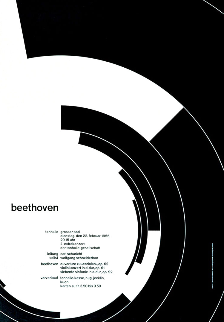
Josef Müller-Brockmann would eschew margins, and never go beyond one single typeface across the page. A higher-order, minimalist purity was met with the series of posters he did for the Zürich Opera house. Müller-Brockmann was asked in an interview what he regarded to be his best work. His self-deprecating answer was the white reverse sides of his posters. I misread that and the image that sprung to mind was the negatives of his posters. This slip became the concept behind my attempt at reproducing the famous Beethoven poster with code only. Here is the demo. Here is the source code, licensed under a Creative Commons attribution license.